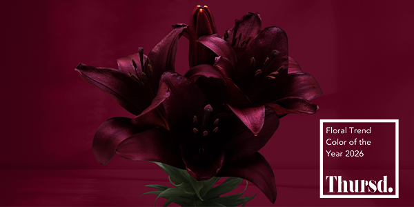
In 2026, floral trends are moving away from light, airy palettes toward more grounded, expressive ones. In alignment with this, Thursd has unveiled the Floral Trend Color of the Year: Crimson Nocturne (#62122A). It’s a deep, muted crimson with warm cocoa undertones that feels rich, steady, and full of emotion.
Crimson Nocturne adds weight and presence to floral designs, inviting florists and designers to slow down and create arrangements that feel intentional, lasting, and meaningful.
Why Crimson Nocturne Matters Now
After years of soft pastels, airy neutrals, and ethereal tones, design trends are changing. Crimson Nocturne signals a return to depth, emotionally and visually. This is not a red that shouts; it’s a red of commitment, reflection, and maturity.
In floral design, colors like this don’t compete for attention; they anchor everything around them. For florists, that means Crimson Nocturne works especially well when you want an arrangement to feel:
• grounded rather than delicate
• expressive rather than decorative
• timeless rather than trend-driven
From Amethyst Glow to Crimson Nocturne
Thursd’s 2025 Floral Trend Color, Amethyst Glow, focused on light, calm, and openness. Crimson Nocturne is its natural next step. Where Amethyst Glow invited us to pause and breathe, Crimson Nocturne invites us to feel. The transition reflects what many clients are asking for now: designs with substance, emotion, and story.
How To Use Crimson Nocturne
Crimson Nocturne works best when it’s used with purpose. A little goes a long way.
In weddings
• Use Crimson Nocturne as a focal bloom in bridal bouquets to add drama and contrast.
• Pair it with soft pinks or muted greens to create balance.
• Incorporate it into evening weddings, fall celebrations, and candlelit settings.
In event design
• Add richness to tablescapes and installations without overwhelming the design.
• Rely on its ability to hold color beautifully in low-light environments.
• Create visual impact using fewer stems.
In everyday and sympathy work
• Choose it for designs that feel appropriate, steady, and thoughtful.
• Bring emotional depth without relying on brightness.
• Deliver arrangements that perform well over longer display times.
A Practical Advantage: Longevity
One of the most useful aspects of Crimson Nocturne is performance. Deeper tones tend to age more gracefully in arrangements, maintaining visual strength longer than pale or highly saturated colors. For florists, that means:
• fewer replacements for multi-day events
• stronger value for customers
• arrangements that look good longer, not just at delivery
This makes Crimson Nocturne especially appealing for premium designs that prioritize quality and longevity.
The Crimson Movement Palette in Practice
Crimson Nocturne anchors the Crimson Movement palette, giving designers flexibility without sacrificing cohesion.
• Red Passion celebrates energy and creativity
• Soft Pink adds romance and lightness
• Rosy Pink brings a fresh, modern edge
• Golden Caramel adds warmth and an autumnal feel
• Nature Green keeps designs grounded and natural
• Forest Teal introduces contrast and modern depth
Used together, these tones allow designers to move easily between moody, romantic, and contemporary looks, all while keeping Crimson Nocturne as the emotional center.
How Crimson Nocturne and Pantone’s Color of the Year Work Together
For 2026, Pantone’s Cloud Dancer speaks to softness, lightness, and calm. It reflects a desire for openness and ease, with airy tones that create a sense of space and serenity. Crimson Nocturne, by contrast, brings weight, emotion, and a grounding presence.
Rather than competing, these two colors complement each other. Cloud Dancer can serve as a foundation, creating lightness and balance, while Crimson Nocturne serves as an anchor, adding contrast, depth, and emotional focus. The pairing reflects a complete design story: light and shadow, softness and strength, stillness and feeling.
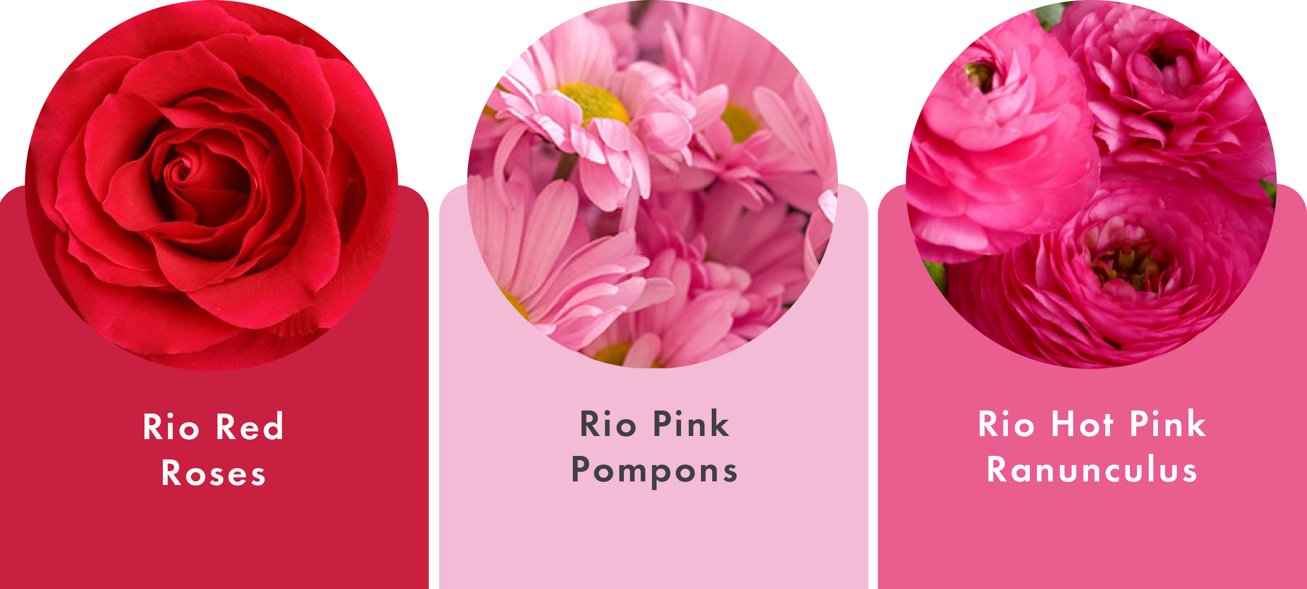
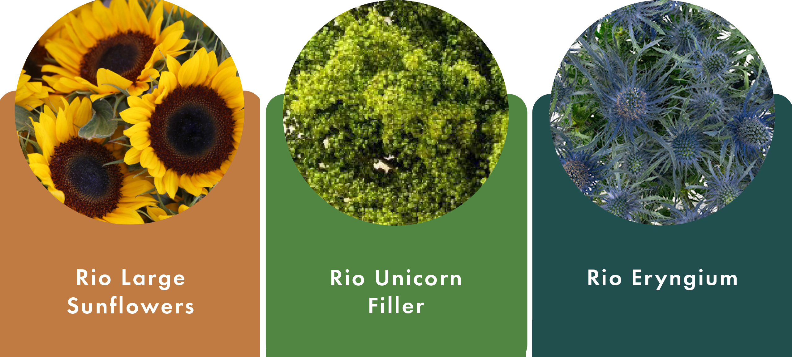
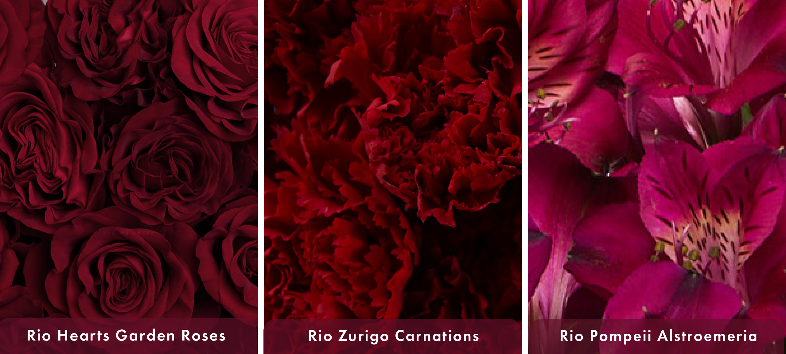
Rio Varieties to Watch: Crimson Nocturne Mood
Florists looking to work within the Crimson Nocturne palette can find natural alignment in several Rio varieties known for depth, richness, and strong presence:
• Deep red roses and garden roses for focal impact
• Burgundy and wine-toned carnations for texture and longevity
• Dark alstroemeria for movement and contrast
• Moody specialty blooms that add depth without overpowering
These varieties bring the Crimson Nocturne experience to real-world designs while delivering reliability and performance.
Designing With Intention
Crimson Nocturne reflects a broader shift in floristry: away from trend-chasing and toward storytelling. Clients are drawn to designs that feel thoughtful, emotional, and personal. This color supports that shift. It encourages florists to design with fewer stems, stronger contrasts, and a clearer purpose, creating work that feels considered rather than crowded.
In 2026, Crimson Nocturne isn’t just a color choice. It’s a design mindset.